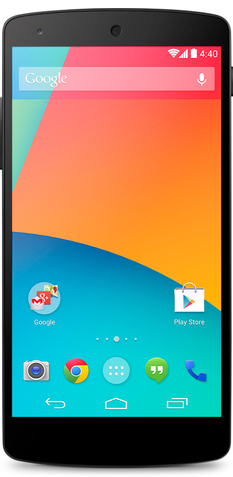
Android KitKat, the most recent version of the Android operating system, has had a bit of a facelift. Gone are the solid black backgrounds and blue accents which defined Android’s aesthetic, replaced by a much cleaner look. On the home screen (pictured), transparency and white icons create a simpler appearance.
While this improves the appearance of Android (in my opinion) it also takes away a subtle visual cue which I found really helpful. In the old Android colour scheme, the network connection icon changed from blue to grey when the internet connection was down. With a rather unreliable router at home, this subtle cue let me know the difference between having to reboot the router and just having to wait a while longer for things to load; because when you live in a rural area, the internet is just terrible.
It’s a minor quibble, I know, but I’ll miss that helpful little indication of network status. It’s a shame when function is sacrificed for form, no matter how insignificant it may seem.
